Widgets Options
Widgets can be customized when they are being created or edited on the Widget Creator, by clicking Options.
Available Options #
Each Widget Type has it's set of configurable options, this is a comprehensive list of all available options:
Table #
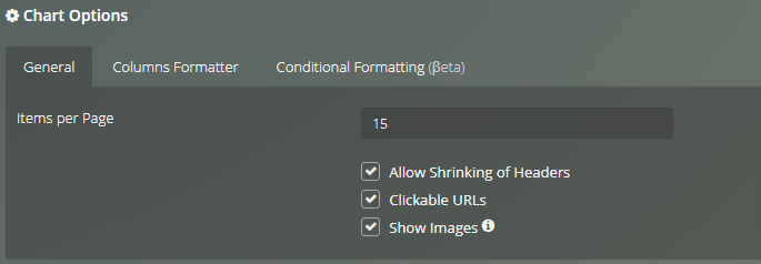
Options available on the General Tab:
- Items per Page: Define the maximum number of rows your table shows per page.
- Allow Shrinking of Headers: Allows your table, if it has a short space to show the full name of all headers, to visually replace the name with suspension points (...).
- Clickable URLs: If your data has URL links (text values that start with http(s)://) they will be clickable.
- Show Images: If your data has URL links tha point to an image (png,jpeg and jpg) the image will be shown.
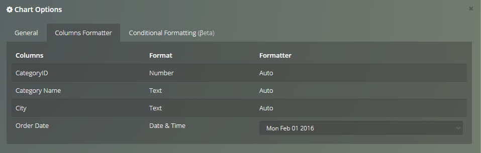
Columns Formatter #
Columns Formatter allows to format date columns of your table, you just need to pick a format from the dropdown list and click Apply.
Conditional Formatting #
Conditional formatting allows to quickly highlight important information in a table.
To add a conditional format, you need to click on Add Condition.
A new condition will be created with empty fields, so you will have to select which column you want to format, depending of the data type of the selected column you will have to choose the condition and the value.
The elements that are included in your condition will suffer your defined visual alterations:
- Text Style: Color of the text (press to remove the color).
- : Text in bold.
- : Text in italic.
- Background Color: Color of the text (press to remove the color).
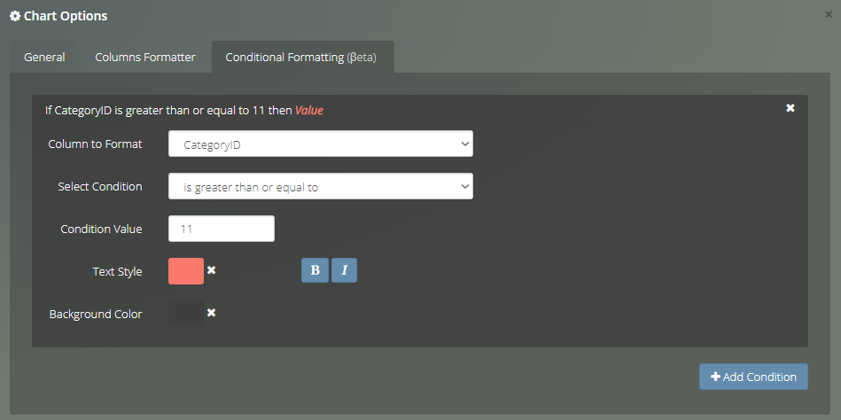
To delete a Conditional Format press the on the header of each Condition.
You can add as many conditions as you want.
Note
Do not forget to click Apply to preview the alterations, changes will only be persisted after you Save or Update the chart.
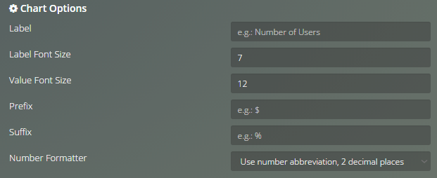
Single Value #
Options available in Single Value Chart:
- Label: Override the text beneath the value.
- Label Font Size: The font size for the label.
- Value Font Size: The font size for the value.
- Prefix: a character or text before the value. e.g.: $
- Suffix: a character or text after the value. e.g.: %
- Number Formater Choose to use 2 decimal place abbreviation.
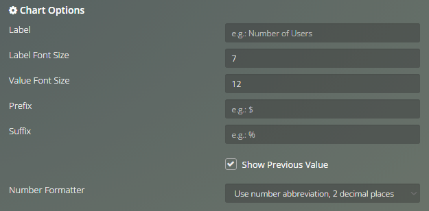
Single Value with Indicator #
Options available in Single Value with Indicator Chart:
- Label: Override the text beneath the value.
- Label Font Size: The font size for the label.
- Value Font Size: The font size for the value.
- Prefix: a character or text before the value. e.g.: $
- Suffix: a character or text after the value. e.g.: %
- Show Previous Value (single value with indicator only) Show or hide previous value.
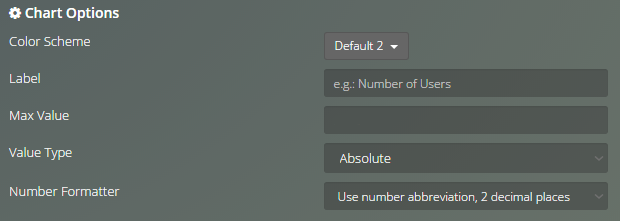
Gauge Chart #
Options available in Gauge Chart:
- Color Scheme: Color palette.
- Label: Description of the value it is representing.
- Max Value: Maximum value of the representation, so it fills up as the measure gets closer to the limit.
- Value Type: Absolute or in percent.
- Number Formatter: Choose to use 2 decimal place abbreviation.
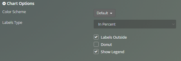
Pie Chart #
Options available in Pie Chart:
- Color Scheme: Color palette.
- Labels Type: Show values, values in percent or labels.
- Labels Outside: Labels position (outside or inside).
- Donut: Make the Pie chart a donut.
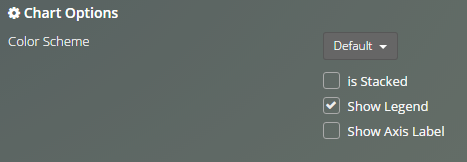
Bar Chart #
Options available in Bar Chart:
- Color Scheme: Color palette.
- is Stacked: Stacked bars or grouped bars.
- Show Legend: Show/Hide the Category legend.
- Show Axis Label: Show/Hide and define the axis labels.
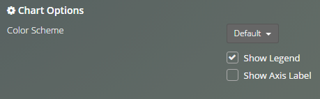
100% Vertical Bar Stacked Chart #
Options available in 100% Vertical Bar Stacked Chart:
- Color Scheme: Color palette.
- Show Legend: Show/Hide the Category legend.
- Show Axis Label: Show/Hide and define the axis labels.
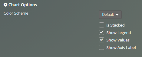
Horizontal Bar Chart #
Options available in Horizontal Bar Chart:
- Color Scheme: Color palette.
- is Stacked: Stacked bars or grouped bars.
- Show Legend: Show/Hide the Category legend.
- Show Values: Show/Hide the Category legend.
- Show Axis Label: Show/Hide and define the axis labels.
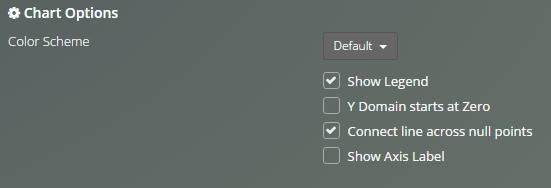
Line Chart #
Options available in Line Chart:
- Color Scheme: Color palette.
- Show Legend: Show/Hide the Category legend.
- Y Domain starts at Zero: Y axis starts at the point 0.
- Connect line across null points: Null points are also considered.
- Show Axis Label: Show/Hide and define the axis labels.
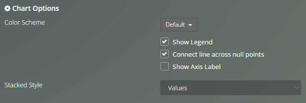
Area Chart #
Options available in Area Chart:
- Color Scheme: Color palette.
- Show Legend: Show/Hide the Category legend.
- Connect line across null points: Null points are also considered.
- Show Axis Label: Show/Hide and define the axis labels.
- Stacked Style: (Area chart only) See values, values in percent or stream.
Funnel Chart #
Options available in Funnel Chart:
- Color Scheme: Color palette.
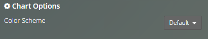
Scatter Chart #
Options available in Scatter Chart:
- Color Scheme: Color palette.
- Show Legend: Show/Hide the Category legend.
- Show Axis Label: Show/Hide and define the axis labels.
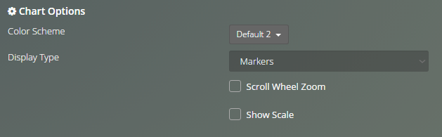
Map Chart #
Options available in Map Chart:
- Color Scheme: Color palette.
- Display type: Markers show a single location point, Heatmap shows a colored area that gets stronger with a higher measure value.
- Sroll Wheel Zoom: Enables or disables using the mouse to zoom the map.
- Show Scale: Show/Hide the scale of the map.
Viur Utils #
Embed Web Page #
Options available in Embed Web Page chart:
- Embed Page URL: Link of the web page to embed.
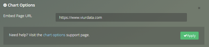
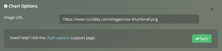
Image #
Options available in Image chart:
- Image URL: Link of the image.
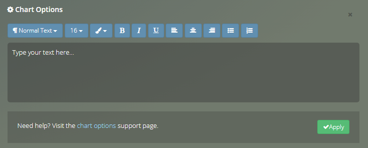
Text #
Options available in Text chart:- : Text style.
- 16: Font size.
- : Font color.
- : Bold text.
- : Italic text.
- : Underline text.
- : Align text to left.
- : Align text to center.
- : Align text to right.
- : Add bullet.
- : Add list.
Note
When customizing a widget don't forget to click Apply to see how your changes affected the chart. Changes will only be persisted after you Save or Update the chart.